Monday 4 April 2011

Evaluation 7

Looking back at your preliminary task, what do you feel you have learnt in the progression from it to the full production?

Doing a preliminary task before the production of my final product gave me greater awareness of how consideration of the target audience determines the outcome of decisions made during the production process. For example the preliminary project was good for me as both the prelimanary and my final product were aimed at the same demographic, my prelimanary was aimed at college students and my main project was aimed at college and older so I was able to use a lot of the features I found out for the preliminary in my main project. Without the preliminary project I wouldn't have learned the skills that I used a lot during my main project for example Blogger, Prezi and Slideshare. During the preliminary I was just getting used to using blogger and uploading but when it came to my final product I was confident using it which allowed me to use it quicker and it was a lot easier. 


I was able to use it for my planning and preparation which was vital as I was able to create a well thought out plan of how I wanted to make my magazine which was a lot easier to do then when I made the plan for my preliminary project. The main skills that I found useful before beginning the final product was the practice in the use of programmes such as, InDesign. After completing the preliminary task I felt that I had the skills needed to create and magazine front cover and other sections of the product. This shows to me how important the preliminary task is to making students feel comfortable with the technology before beginning that final task. 

There are other programmes that I didn't need the practice with Such as, Photoshop. This is a programme that I feel incredibly confident with because I have this programme at home and I have used it whilst doing GCSE media. The experience with Photoshop helped me manipulate photos in ways that I wouldn't have been normally able to do. Not everyone has these opportunities and I felt the need for the preliminary task, showing how necessary the preliminary task is and showing how much students learn from it and how they adapt this knowledge to the final task.    
Evaluation 6

What have you learnt about technologies from the process of constructing this product?

I have created a Prezi account to illustarte how technology has aided the process of the Production of each aspect of my magazine.

http://prezi.com/zs5zi_5yfhuh/what-i-have-learnt-about-technology-in-the-process-of-the-production-of-my-magazine/

Sunday 3 April 2011

Evaluation 5


How I addressed my audience when designing

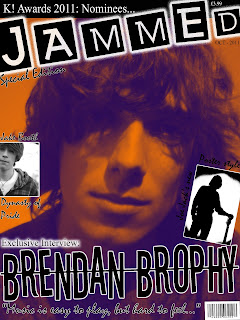
Firstly, when deciding on the design for the masthead I went through many different fonts. Getting the right masthead font is the key to the attraction of the magazine. The masthead will become known and create synergy with my magazine style. I chose this font because this font is based on the design of stencils. By using stencils it shows connotation of graffiti. This appeals to my audience because graffiti is known for being a young art form. 
Everything on the front cover is to attract my demographic and one of the most important features of the cover to appeal to the audience is the photo. The image of the male model is vital. I chose to take my photo close up to capture he features. The model has long her and generally his style reflects the audience so the demographic can relate themselves to the person of the cover. Once I had taken the photo I used gradient map to create this orange effect which makes it more unique.   With the main tag line to my magazine cover I chose this font because mainly it is incredibly clear. What I loved about this is that the letters are not even and are crooked. The clarity was to make the font stand out but the bizarre crooked style makes it looks like careless style. This careless and sloppy style reflects the audience making it seem like it was designed by the people that will read it. This is a theme that I tried to carry out throughout the entire magazine.   

The smaller and insignificant, less important fonts on this magazine cover have been designed with a font called mistral. Mistral is a great font that looks like a very stylish and artistic font. It looks realistic due to it looking like hand writing. By using a font that looks like hand writing it again appeals to my target audience because it makes it seem like anyone could have designed it, including them. The entire magazine has a theme of a realistic style especially in the fonts.

Friday 1 April 2011

Evaluation 4

Evaluation 1

Forms and conventions of real media products


This is a link to the website slideshare. This website has helped me create my first evaluation point. This is a very useful site. However, there was problems with uploading so the font sizes have changed unexpectedly. Please forgive this error and enjoy the powerpoint.

Tuesday 29 March 2011

Evaluation 3

Media institutions that might distribute my magazine


There are many different types of media institutes across the world. The publisher I would use to publish my magazine would be Bauer media. The reason for this is that Bauer is one of the biggest media institutions in the world. This makes the company more reliable and stable, Bauer also are the publishers for the magazine Kerrang! and this means they have experience with a magazine with a similar ethos and demographic. Bauer is a well known publisher and millions of people read the magazines published by Bauer, giving me the best opportunities to make money and create a large readership. Through their company they will help get y magazine going through advertising and many other contemporary methods of marketing such as, viral marketing.

Distribution
The kind of distribution methods I would use would start at putting copies of my magazine in retail shops such as, WH Smiths and Newsagents. This is a good place to start because it is the most common way and most trusted way and reliable way of getting copies of my magazine sold. This is still the most popular way of selling magazines and that is purely the reason. I would expand this to supermarkets like Tesco and Asda as well due to the large amount of people that shop there it makes the magazine a lot more likely to sell simply due to the amount of shoppers.
However, the internet is increasing becoming a more popular way of selling and reading magazines and much more such as EGM issues. This is something I wouldn't do straight away because it's not that popular and reliable yet. I would move on to this as it carries on to get more popular. I would sell a code that allows you to read it on the internet but also expanding it to audio on Ipods and readable copies for the Ipad. If times change so much that it all transfers to internet I will also release a print out version because there will always be an audience that will still want to read something off paper. Evolving with the technology as it changes over the generation is vital to keep up to date with the youth (demographic). Because if I don't keep up that when losses will occur. 

Monday 28 March 2011

Evaluation 2

Social Groups that fit into my demographic and readership/target audience


Some magazine demographics tend to have stereotypical social groups tag and linked to them. People make judgements on peoples social groups and music taste this is represented through the thought process of of 'Indies' like MNE and 'Emos' and 'moshers' like Kerrang! Although this maybe untrue in some cases it has been shown that generally this judgement is correct. My magazine is similar in target audience to Kerrang and this is shown through the representation of the young people in the photos in my magazine. In my magazine all males in the magazine have long hair and dress in causal clothing, this is clearly shown in my front cover where it is a close up shot of a male who looks relaxed with long hair and this my stereotypically fits into the drug culture image found in festivals. Generally most people with this image like and have an interest in rock music and this help capture my perfect audience through social groups.  The magazine appeals to a specific niche audience because it concerns topics and themes that are relevant to people who listen to and are interested by rock music and its background. 
Kerrang! identifies its audience as ‘individually minded, independent of thought and musically experienced, an audience defined by attitude, passion and loyalty’. Kerrang distinguish their identity as a world ‘where Jackass meets Playstation and Skate culture meets ipod’ In the period 01-Jul-2008 to 31-Dec-2008 Kerrang!‘s circulation sales in the UK and the Republic of Ireland were at a high of 50,128 insuring it remained the market-leading music weekly. These figures display that Kerrang! is a successful magazine despite its audience being one demographic entity. This is the closest magazine target audience to me represents the social group that may by my magazine.