Sunday, 3 April 2011

Evaluation 5


How I addressed my audience when designing

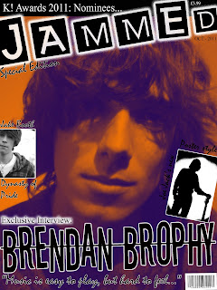
Firstly, when deciding on the design for the masthead I went through many different fonts. Getting the right masthead font is the key to the attraction of the magazine. The masthead will become known and create synergy with my magazine style. I chose this font because this font is based on the design of stencils. By using stencils it shows connotation of graffiti. This appeals to my audience because graffiti is known for being a young art form. 
Everything on the front cover is to attract my demographic and one of the most important features of the cover to appeal to the audience is the photo. The image of the male model is vital. I chose to take my photo close up to capture he features. The model has long her and generally his style reflects the audience so the demographic can relate themselves to the person of the cover. Once I had taken the photo I used gradient map to create this orange effect which makes it more unique.   With the main tag line to my magazine cover I chose this font because mainly it is incredibly clear. What I loved about this is that the letters are not even and are crooked. The clarity was to make the font stand out but the bizarre crooked style makes it looks like careless style. This careless and sloppy style reflects the audience making it seem like it was designed by the people that will read it. This is a theme that I tried to carry out throughout the entire magazine.   

The smaller and insignificant, less important fonts on this magazine cover have been designed with a font called mistral. Mistral is a great font that looks like a very stylish and artistic font. It looks realistic due to it looking like hand writing. By using a font that looks like hand writing it again appeals to my target audience because it makes it seem like anyone could have designed it, including them. The entire magazine has a theme of a realistic style especially in the fonts.
No comments:

Post a Comment